Monday, August 06, 2007

Boxing


This is a joke painting I did for a friend's birthday. It's "inspired" by the famous 1965 photo of Muhammad Ali and Sonny Liston.

Special thanks to the folks at ARTJUMBLE for putting me as their spotlight artist this week. Check out their sweet drawing jams at http://artjumble.blogspot.com

Monday, July 23, 2007

Doodles


Been thinking about a couple of stories recently so, there's been a lot of sketches...

I had planned on doing a story with Non-Sensical up there but, really trying to figure the character has revealed a bunch of major flaws in the design. I think I'll have to redesign a character if I want to draw a story involving him.

Saturday, July 07, 2007

Half @$$ed tutorial


Hey there,

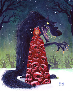
First off, HAPPY BIRTHDAY to my beautiful wife. Above is a painting I did for her birthday (July 8th.) She's the reason the skull motif has shown up in my last few paintings, but those paintings all ended up going to someone else so, I figured it was about time I did one for her.

As usual, the original idea was not the end idea with this painting. I was going to do something similar to the piece I did for the EMERGENCY Auction (except this would be acrylics, not watercolour) but she would be in a hooded cloak instead of a kimono. I did a quick thumbnail, thought, "That's it" and went right to the illustration board.

I should have done more exploration drawings before I went to the board. Red Riding Hood popped into my head, and I went with it. What followed was a lot of erasing and re-drawing since I had no idea what the design for the wolf should be. Eventually, I got something I was kind of happy with. Looking back, I wish I had spent more time (a lot more time) pushing the design of the wolf. Eventually, I ended up with this drawing...
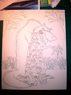


Now in my previous skull paintings, lighting hasn't been much of an issue. I wanted to incorporate a little more light and shadow into this one so, I did an underpainting for this as my first step. As a side note, I decided to block in the shadows, light, etc. with Payne's Grey. The acrylics I use are the same bottles I bought when I was in college so, they're kind of old. I hadn't realized until now that my Payne's Grey is now BLUE! I know it is usually a cooler grey, but this stuff has aged into a nearly indigo blue. If you have some old Payne's lying around, you might want to check it. Luckily, I was going to do a painting with a cooler temperature colour scheme so it wasn't a total disaster. Good thing I wasn't going for a nice warm Coppola/Gordon WIllis feel...
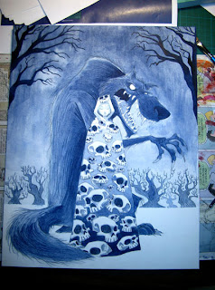


From here, I started to lay in some layers of colour in the sky. I wanted it to be a kind of night time snow scene, but I didn't want it to be the usual blue=night colour scheme, so I went with more of a green sky. With the lighter end of the sky near the horizon, I added some white to the green to lighten it more, and I did some thin washes of it over the trees to try and add a bit of a misty, atmospheric feel. It knocked back the trees how I hoped, but it wasn't entirely successful. I guess ideally, I could have used an airbrush, but I prefer not to.
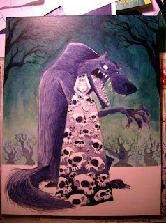


I thought the sky was looking a bit dull after the white incident so, to try and add some depth and translucency, I layered in some glazes of yellow and a yellowy-green. Happier with this, I move on to the wolf. Mainly, I darkened him as I wanted him to be pretty close to a silhouette yet, with elements of detail still visible within the overall shape. I added some rim lighting to help seperate him from the background a little more. I also did his teeth and claws as an off white. I intended to have his eyes white as well at this point.
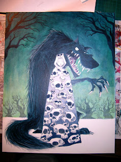


You can't see much of a difference in this one as I'm now at the point of miniscule adjustments. It was around this time that I started thinking yellower teeth, claws and eyes. Also, I thought that would help with the overall colour harmony. I kept trying to make the wolf darker as well at this point.
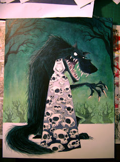


Around this time I apparently became really focussed on getting the painting working, and completed. In other words, I don't have any more pictures of the painting in progress. The last time I tried to do one of these photo tutorials, I never even finished the painting so, at least this was finished. Let's see if I can break down what I did next...

First I did what I was just talking about, I yellowed the eyes, as well as his claws and teeth.

After that, it was on to the girl. I layered in an intense red colour near the top because I wanted her to pop. Painting around the skulls, I layered in red to the rest of her cloak. As I got toward the bottom I had to layer in some darker reds and purples. Even though the dark is there in the under painting, acrylics aren't 100% transparent so it tends to lessen the darks and lights moving them closer to a mid-tone at times. So, you have to go in and punch those up. The underpainting is more of a guide than anything else. It tells you what you want to do, or should remember to do.

After I was happy with that, I thinned some red down with matte medium and made a nice glaze that went over the entire cloak, skulls and all. Now the skulls were kind of a pinky red, and the whole cloak felt like a unified whole. I went back in and punched up more of the darks on the cloak and then went onto the skulls...

The skulls were unified to the cloak, but I still wanted them to pop like in the other paintings so, I thinned down some white with Matte Medium and went in and added highlights to the skulls, strengthening the overall lighting effect on them.

Once I was reasonably happy with the cloak, I moved on to her face, adding a thin layer of flesh tone and slowly building it up, hoping not to effect the shadows I had already layered in.

From there it's just adjusting and detailing until it gets to that point where I don't want to do any more in fear of screwing it up. I like to step away for a while now and come back with a fresher eye in hopes of finding some stuff to fix that I couldn't see before.

At this point, I went back in and worked on the snow around their feet and on the ground. I added some green to the snow in the back near the trees to help with the depth. I also tried to make it look like they were standing IN the snow and not ON the snow. I also added a bit of a shadow to help ground the characters.

After that, I added the last element, the falling snow. This was done in 2 passes if you will. The first pass was with kind of a light blue green for the snow in the background. I then did bigger white snow of varying size for the foreground. Doing two colours of snow is a good trick to add depth to falling snow so that it doesn't look like it's falling just in front of the characters.

That's pretty much it.

Tuesday, July 03, 2007

You Squid


I've discovered a saying from my youth, "You squid" or, more of a name calling really was specific to my hometown of Calgary. With further research, it may even be found out that this specific nomenclature may even be specific to the school I went to. Squid was a term used like "geek" or, "nerd." I believe this was during my junior high years. As a side note, I was a squid i.e NOT COOL. I liked to draw, and I liked comic books, of course I was a squid. I gained a small amount of respect when I made the grade 8 basketball team in grade 7, but I suspect I was then known as "The squid who could play basketball." You can look at this bit of information as either a) useless or, b) A feeble attempt to get the kids of today to bring back the word SQUID and make it the next big thing. So get out there, pull up your pants, and call an unsuspecting bystander a SQUID.

So, the above character is certainly no "squid," she is the creation of a Mr. Jamie Baker. I did this drawing of his character SEPHALINA AKA NAUTI-GIRL or, SQUID GIRL. Jamie's good. Really good. You should check out his blog. See the links I added on the right? He's in there. You should buy some of his comics when you're there, or a sketchbook or something. His comic ROCKET RABBIT is refreshing and funny. Solid funny book entertainment for your hard earned loonie, dollar, euro, or peso.

Go now!

By the way, if you haven't seen it yet, go see RATATOUILLE. BRILLIANT. Brad Bird is saving animation. Those fellas at Pixar are doing a pretty great job as well.

Hey, you know who worked on Ratatouille? That's right, JAMIE BAKER. Go to his site now!!! Go see the movie too!

Squid.

Sunday, June 24, 2007

R.I.P VIKING ARM


A sad day. Viking Arm is no more. There's only so much you can do against a bad @$$ with metal balls. Cannon Father took out Viking Arm and went on to win the entire Western Division. Kudos to Cannon Father, I'm hoping he goes ALL THE WAY. Great character!

Above is the original character and below you will found some of the smack talk from the various rounds. It wasn't enough. I had a blast though and look forward to entering another character in a future match. Kudos go out to Sam Hiti for the BRILLIANT idea that is FIST-A-CUFFS!

I wish I had spent more time on my smack talk drawings but, time didn't really permit. This is a different style of inking for me, I don't really have it figured out yet. I think the second drawing is slightly more successful.


VOTE now. The next bracket is about to start.

Other assignments have taken me away from barbarian girls but, I'll post a barbarian in a few days and something else after that... hopefully something else after that as well.

Thursday, June 07, 2007

Saturday, June 02, 2007

Red Sonja


Been drawing lots of hairy barbarians and vikings for some reason lately. Thought I should switch it up with a barbarian lady. I would go insane if I had to draw an entire comic with this character, her skimpy outfit takes forever. Lucky for me, no one is knocking down my door to draw a Red Sonja comic.

Maybe I should have posted the pencils with this one, I did a lot of reworking/fixing (?) in the ink stage...

P.S DON'T FORGET TO VOTE IN FIST-A-CUFFS!!! SEE POST BELOW FOR DETAILS.

Tuesday, May 29, 2007

Fist-a-Cuffs

FIST-A-CUFFS has begun. GO VOTE NOW!

I'm in the battle, but as the new rules state, I can't reveal which character is mine.

NOW GO VOTE!!!

FIST-A-CUFFS

Wednesday, May 23, 2007

Sketchcrawl 14

Well, this past weekend was Sketchcrawl 14 and the Sketchcrawl Auction benefiting EMERGENCY. It was a great weekend and I got to meet some really cool people. I think I heard that Saturday and Sunday raised somewhere around $10,350.00!!! Good job to everyone who donated, sketched, and purchased art.

Here's my offering of sketches from Saturday...


This was easily my most productive Sketchcrawl. I think part of it had to do with the fact that I switched to sketching with a brush pen. Forced me to look more at gesture and shapes, instead of detail. I need to do more of this...


Monday, May 14, 2007

Lady Coddingham and her Kimono of Souls


So, I somehow managed to get to be involved in a GREAT art auction that's happening Sunday, May 20th at Maverix Studios in San Francisco. The Auction is benefiting a humanitarian organization called EMERGENCY -life support for civilian war victims.

You can learn more about it by going to...

http://www.sketchcrawl.com/blog

There are some really AMAZING artists that have contributed art for the cause, artists FAR better than me. In fact, not really sure what I'm doing there.

The day before is SKETCHCRAWL 14 which is also benefiting EMERGENCY. You can find a sponsor form on the Sketchcrawl site but instead of having to run an abnormally long distance, or sell a lot of candy bars, it's all about the drawing count... eek, Fox Animation flashback there for a second. Any ways, get out there and DRAW!!! Help some people out. Sharpen those pencils, pick up those watercolours and get out and draw on Saturday for a good cause.

A couple notes about this painting. This was actually started from one of the sketches from my DRESS OF SOULS post, I think it was near the bottom. Any ways, in the refining the drawing process, it became a kimono. This is all watercolour. Haven't used those for a character painting in a long time.

Also, props should go out to my beautiful wife who suggested the tree branch to help balance out the composition. I knew it needed something and as usual, my solution was overly complicated. She said, "What about a tree branch?" and the light went on. Nice work to her!

Friday, May 11, 2007

Captain ****


Done a bunch of stuff that I can't quite show yet, so until then here's a phone doodle of one of the characters from NEXTWAVE. Oh how I miss Nextwave. One of the greatest comics EVER!!!

More soon.

Friday, May 04, 2007

Caricatures


Caricatures, I've said it before and I'll say it again, not my strength, but people keep asking me to do them. This top one was for a friend's anniversary, his wife asked me to do something they could put up in their house. As you can see, I ripped off Phillipe Burke's technique, except not drawn as well. This was pretty fun. His stuff is great to study just for his use of colour theory.


These are some sketches for something I just finished. I'll post it later. It involved a number of celebrity caricatures so, I had to figure out how I was going to draw them before I did the final art. This was a little tricky because some of the characters in this were already drawn in my "cartoony" style so, I had to try and match the other caricatures to that style. I find this to be a struggle at times, finding a way not only a way to have a successful caricature of someone, let alone then come up with a simplified cartoon version of that caricature. I know people that can do it no problem, but for me it's as a lot of drawings and steps. Some of these turned out reasonably successful, others could still use work.

Monday, April 30, 2007

More b-days


Here's a couple of drawings that I did for some friends that had Birthdays recently. I'll post these for now. Just got back from the honeymoon and have some Maui sketches to post, but they haven't been scanned yet. These will have to do for now.

This second one is a drawing of my friend Robert. It's what he would look like if I gave him my dog's body proportions for his birthday. Not sure how I would do that, I guess extensive plastic surgery. Yes, I was dropped a lot as a child.

Monday, April 16, 2007

Testing testing...


Well, after years and years of using the scanner at whatever job I had, I finally went and purchased my own. Unemployment will do that to you I guess. Oh well, I was long over due. I was just doodling with a ballpoint pen the other day and this is what happened. Thought I'd use the page as a test for the new scanner. After some adjustments, I think it might work out okay. Next we'll see how it handles more than one colour!

Friday, April 06, 2007

PAge 10


And so it ends.

Here's where the story definitely needed some space. I wish I had a little bigger page count to come up with a more clever ending than an explosion. That said, I have no idea what that more "clever" ending would be. Sometimes, the kids just want an explosion.

I also am not sure that it's clear that Jump is using the explosion to close the portal, not necessarily destroy the giant beast on the other side.

Well that's it. Until the next Jump Cannon story... see ya later. I might post some of my ridiculously tight thumbnails for this story next week. Maybe I'll explain why they were so damn tight too.

Thursday, April 05, 2007

Wednesday, April 04, 2007

Page 8


Here's where things start to fall apart for the story. I'm running out of pages, and still lots to do. I think I could have benefited from a few more panels in this section to help set the mood more, as well as build up to what Krueger is up to. I think I could have played up the VZA's surrounding Jump more, hopefully building some more tension into this section, but I was running out of space.

I do still like the idea of using a big pile of brains to open a portal though.

Tuesday, April 03, 2007

PAGE 7


Poor Fizz, it's rough being a sidekick. Again, this is a time when I wish I had a few more pages to work with. It's tough to feel the emotion of the loss of a character when you've only known him for six pages. I think the beats work reasonably well, but I could have used a little more time to really punch up the emotion.

That may not necessarily have made the moment better though because truthfully, I think my initial inspiration for this moment was laughs. For some reason, I found it amusing that Jump was a character that went through sidekicks like other people go through um... disposable socks. Do they make those? Any ways, maybe you understand what I'm getting at.

With more time, maybe the audience would have liked Fizz too much, making the moment too sad. Of course, most people don't think there is much humour in death, that's probably why I can never find funny sympathy cards in the card store.

Monday, April 02, 2007

Page 6


This is my favorite page of the whole story. I got this idea that it would be cool if I could make the Krueger backstory look like grainy black and white film footage. Thanks to the genius of photoshop, I was able to pull it off reasonably well. I found some brushes on the internet that helped me make the images look like scratched, beat up, dirty film. Anything to mask the HEAVY exposition I guess.