Monday, November 26, 2007

RAGNAROCK


I ended up doing two paintings for the latest Maverix Studios auction this time. To learn more about the auction, check out the MAVERIX link on the right.

The first painting is called RagnaROCK. Hopefully I can put my obsession with drawing vikings to rest now that this painting has gotten it out of my system? This is 8"X10" acrylic on illustration board

The painting below is my second for the auction, and is quite obviously titled, "She Dreams of Pop Stardom." When I set out to do the two paintings, I had no intention of making them thematically linked by music, but it happened. When I was sketching out the viking, he was holding an actual axe and then I thought what if he's holding an AXE? Next thing I knew, I was drawing a guitar. Then I moved onto the girl, and the title popped into my head. I also decided I wanted to do something that incorporated lettering. This one is 5"X7" Acrylic and Gouache on watercolour paper. The lettering is gouache, everything else is Acrylic.

Tuesday, November 20, 2007

Not up to snuff


What better things to post on your blog than REJECTS! Why post your best work when you can post stuff that just isn't that great! Yes! That's what everyone wants to see.

Maverix Studios has another charity auction coming up and I was lucky enough to be asked to do some work for it. I ended up doing a couple of paintings that I'll post a little closer to the auction date.

This painting above is a self rejected piece. Something weird happened with the pigment in the watercolour I used on her jacket and it kinda ruined the painting. Looking at this again, I'm not that thrilled with the drawing either, so I guess all was the best.

Friday, November 09, 2007

Random randomness


Page of doodles. Um, that girl's face in the upper right, just below the guy with the weird neck, I ripped that off of a Miss Arnette drawing from her blog. I think there was something to the arrangement of her features that I wanted to remember so, I did a quick study. Check out her blog in my links, she's REALLY good.

Monday, November 05, 2007

Searching...


These are a couple of pages of sketches where I was trying to find the designs of the characters in the Capt. Courage comic (which can be seen a couple of posts below this.) You'll also notice my first attempt at the FACA Arena Girl that I self rejected due to general crappiness and sucky drawing.

Wednesday, October 31, 2007

Happy Halloween


I designed a t-shirt for KUPD'S MONSTER MOSH their big Halloween party they're having tonight.

Thursday, October 18, 2007

REJECTION

Rejection is something I think most artists need to get used to. It happens a lot in this business. Being currently unemployed, I have been dealing with a fair bit lately as I search for a more full-time employment situation than my current sparse freelance work. Maybe it's good though, it allows us to reassess our goals and maybe provides that bit of sour that the sweet needs to be properly enjoyed. That said, it still sucks.

As I try to figure out my next move, I have been working on a few side projects. One was submissions for someone I came in contact with a few months ago. This, as the title of this post says was REJECTED. No worries though, now I can share it with the 7 people that read this blog... okay 10.

There was a question in the comments so to clarify, I wrote, drew, and coloured this.


Thursday, October 11, 2007

AVATAR


Haven't worked on much stuff that I can show at this time so, here's my new avatar.

Friday, September 28, 2007

FACA Ring Girl


Head on over to Fist-a-cuffs (link on the right) and check out everyone's sweet ring girls! Here's my contribution. Everyone was giving their girls fanciful names so, mine is named Jane Smith.

Below is the reject. Not sure how I let this get all the way to ink before I realised how bad it is. I guess I thought I could fix it. Alas, I could not. My scanner cut off her feet, they were drawn. It's a reject so, no re-scan.

Have a good weekend blog readers!

Wednesday, September 19, 2007

Babies galore


So, a lot of friends have had babies lately. These are a couple of drawings I did for one of those friends...

Thursday, September 13, 2007

Happy birthday old man


I figured that since I worked with him for so long, that I should do something nice for Don's big 70th birthday. This is the card I sent him.

Happy birthday sir.

Wednesday, September 12, 2007

The Brush Pen


During a Sketchcrawl in April (The above pic is from the most recent crawl), I discovered the benefits of sketching with one of those Faber Castell PITT brush pens. I have pretty much been sketching on location exclusively with this pen ever since. I think I like it so much because it forces me to loosen up, and only put down the most essential of details.

I went through a tree obsession a while ago, here's a selection of trees.


The View from our apartment balcony...


Friday, August 24, 2007

THE EXCEPTION...


Some buddies of mine have an online magazine called MR. JUDAS and one of them, the cool and hilarious Perry Crow wrote a sort of long prose Superhero story. A while ago, he asked me to envision what this character, THE EXCEPTION might look like. This was the result. Go check out MR. JUDAS NOW!

Monday, August 20, 2007

Random doodles


Freelance is keeping me busy this week so, nothing new, but here's some doodles I forgot to post.

The first one is a study from a story I will eventually get off of my @$$ and draw.

Below is just letting my mind wander. Looks like I FINALLY figured out an appealing profile for Non-Sensical Rapper. It's weird how such things can elude you some times. I must have done 20 versions that all sucked. I stepped away, and a day later I'm sitting on our balcony sucking back a cold frosty one and BAM, the image appears in my brain. I scrambled for some paper and drew it, finally! Honestly, it's like pullng teeth some times.

I have fun drawing cartoony versions of Wolverine, I should try a finished drawing of him in that style... I'll put that on the to do list...

Wednesday, August 08, 2007

Monday, August 06, 2007

Boxing


This is a joke painting I did for a friend's birthday. It's "inspired" by the famous 1965 photo of Muhammad Ali and Sonny Liston.

Special thanks to the folks at ARTJUMBLE for putting me as their spotlight artist this week. Check out their sweet drawing jams at http://artjumble.blogspot.com

Monday, July 23, 2007

Doodles


Been thinking about a couple of stories recently so, there's been a lot of sketches...

I had planned on doing a story with Non-Sensical up there but, really trying to figure the character has revealed a bunch of major flaws in the design. I think I'll have to redesign a character if I want to draw a story involving him.

Saturday, July 07, 2007

Half @$$ed tutorial


Hey there,

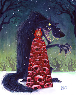
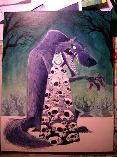
First off, HAPPY BIRTHDAY to my beautiful wife. Above is a painting I did for her birthday (July 8th.) She's the reason the skull motif has shown up in my last few paintings, but those paintings all ended up going to someone else so, I figured it was about time I did one for her.

As usual, the original idea was not the end idea with this painting. I was going to do something similar to the piece I did for the EMERGENCY Auction (except this would be acrylics, not watercolour) but she would be in a hooded cloak instead of a kimono. I did a quick thumbnail, thought, "That's it" and went right to the illustration board.

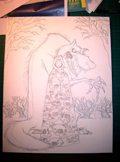
I should have done more exploration drawings before I went to the board. Red Riding Hood popped into my head, and I went with it. What followed was a lot of erasing and re-drawing since I had no idea what the design for the wolf should be. Eventually, I got something I was kind of happy with. Looking back, I wish I had spent more time (a lot more time) pushing the design of the wolf. Eventually, I ended up with this drawing...


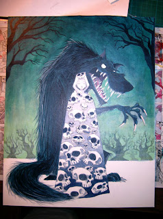
Now in my previous skull paintings, lighting hasn't been much of an issue. I wanted to incorporate a little more light and shadow into this one so, I did an underpainting for this as my first step. As a side note, I decided to block in the shadows, light, etc. with Payne's Grey. The acrylics I use are the same bottles I bought when I was in college so, they're kind of old. I hadn't realized until now that my Payne's Grey is now BLUE! I know it is usually a cooler grey, but this stuff has aged into a nearly indigo blue. If you have some old Payne's lying around, you might want to check it. Luckily, I was going to do a painting with a cooler temperature colour scheme so it wasn't a total disaster. Good thing I wasn't going for a nice warm Coppola/Gordon WIllis feel...


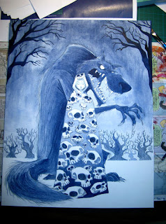
From here, I started to lay in some layers of colour in the sky. I wanted it to be a kind of night time snow scene, but I didn't want it to be the usual blue=night colour scheme, so I went with more of a green sky. With the lighter end of the sky near the horizon, I added some white to the green to lighten it more, and I did some thin washes of it over the trees to try and add a bit of a misty, atmospheric feel. It knocked back the trees how I hoped, but it wasn't entirely successful. I guess ideally, I could have used an airbrush, but I prefer not to.


I thought the sky was looking a bit dull after the white incident so, to try and add some depth and translucency, I layered in some glazes of yellow and a yellowy-green. Happier with this, I move on to the wolf. Mainly, I darkened him as I wanted him to be pretty close to a silhouette yet, with elements of detail still visible within the overall shape. I added some rim lighting to help seperate him from the background a little more. I also did his teeth and claws as an off white. I intended to have his eyes white as well at this point.


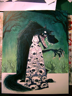
You can't see much of a difference in this one as I'm now at the point of miniscule adjustments. It was around this time that I started thinking yellower teeth, claws and eyes. Also, I thought that would help with the overall colour harmony. I kept trying to make the wolf darker as well at this point.


Around this time I apparently became really focussed on getting the painting working, and completed. In other words, I don't have any more pictures of the painting in progress. The last time I tried to do one of these photo tutorials, I never even finished the painting so, at least this was finished. Let's see if I can break down what I did next...

First I did what I was just talking about, I yellowed the eyes, as well as his claws and teeth.

After that, it was on to the girl. I layered in an intense red colour near the top because I wanted her to pop. Painting around the skulls, I layered in red to the rest of her cloak. As I got toward the bottom I had to layer in some darker reds and purples. Even though the dark is there in the under painting, acrylics aren't 100% transparent so it tends to lessen the darks and lights moving them closer to a mid-tone at times. So, you have to go in and punch those up. The underpainting is more of a guide than anything else. It tells you what you want to do, or should remember to do.

After I was happy with that, I thinned some red down with matte medium and made a nice glaze that went over the entire cloak, skulls and all. Now the skulls were kind of a pinky red, and the whole cloak felt like a unified whole. I went back in and punched up more of the darks on the cloak and then went onto the skulls...

The skulls were unified to the cloak, but I still wanted them to pop like in the other paintings so, I thinned down some white with Matte Medium and went in and added highlights to the skulls, strengthening the overall lighting effect on them.

Once I was reasonably happy with the cloak, I moved on to her face, adding a thin layer of flesh tone and slowly building it up, hoping not to effect the shadows I had already layered in.

From there it's just adjusting and detailing until it gets to that point where I don't want to do any more in fear of screwing it up. I like to step away for a while now and come back with a fresher eye in hopes of finding some stuff to fix that I couldn't see before.

At this point, I went back in and worked on the snow around their feet and on the ground. I added some green to the snow in the back near the trees to help with the depth. I also tried to make it look like they were standing IN the snow and not ON the snow. I also added a bit of a shadow to help ground the characters.

After that, I added the last element, the falling snow. This was done in 2 passes if you will. The first pass was with kind of a light blue green for the snow in the background. I then did bigger white snow of varying size for the foreground. Doing two colours of snow is a good trick to add depth to falling snow so that it doesn't look like it's falling just in front of the characters.

That's pretty much it.

Tuesday, July 03, 2007

You Squid


I've discovered a saying from my youth, "You squid" or, more of a name calling really was specific to my hometown of Calgary. With further research, it may even be found out that this specific nomenclature may even be specific to the school I went to. Squid was a term used like "geek" or, "nerd." I believe this was during my junior high years. As a side note, I was a squid i.e NOT COOL. I liked to draw, and I liked comic books, of course I was a squid. I gained a small amount of respect when I made the grade 8 basketball team in grade 7, but I suspect I was then known as "The squid who could play basketball." You can look at this bit of information as either a) useless or, b) A feeble attempt to get the kids of today to bring back the word SQUID and make it the next big thing. So get out there, pull up your pants, and call an unsuspecting bystander a SQUID.

So, the above character is certainly no "squid," she is the creation of a Mr. Jamie Baker. I did this drawing of his character SEPHALINA AKA NAUTI-GIRL or, SQUID GIRL. Jamie's good. Really good. You should check out his blog. See the links I added on the right? He's in there. You should buy some of his comics when you're there, or a sketchbook or something. His comic ROCKET RABBIT is refreshing and funny. Solid funny book entertainment for your hard earned loonie, dollar, euro, or peso.

Go now!

By the way, if you haven't seen it yet, go see RATATOUILLE. BRILLIANT. Brad Bird is saving animation. Those fellas at Pixar are doing a pretty great job as well.

Hey, you know who worked on Ratatouille? That's right, JAMIE BAKER. Go to his site now!!! Go see the movie too!

Squid.

Sunday, June 24, 2007

R.I.P VIKING ARM


A sad day. Viking Arm is no more. There's only so much you can do against a bad @$$ with metal balls. Cannon Father took out Viking Arm and went on to win the entire Western Division. Kudos to Cannon Father, I'm hoping he goes ALL THE WAY. Great character!

Above is the original character and below you will found some of the smack talk from the various rounds. It wasn't enough. I had a blast though and look forward to entering another character in a future match. Kudos go out to Sam Hiti for the BRILLIANT idea that is FIST-A-CUFFS!

I wish I had spent more time on my smack talk drawings but, time didn't really permit. This is a different style of inking for me, I don't really have it figured out yet. I think the second drawing is slightly more successful.


VOTE now. The next bracket is about to start.

Other assignments have taken me away from barbarian girls but, I'll post a barbarian in a few days and something else after that... hopefully something else after that as well.